TITLE ORDER AND CONNOTATIONS
Title Sequence Order:
In all opening title sequences made in media, there is an order of titles that must be followed. This order is:
(NG)
In all opening title sequences made in media, there is an order of titles that must be followed. This order is:
- Distribution Company Logo
- Investors
- Production Company Logo
- Production Company
- Production Team
- Movie Team
- Stars (Actors and Actresses)
- Casting Directors
- Music Composers
- Hair and Make-Up Artists
- Costume Designers
- Editor
- Production Designer
- Director of Photography
- Line Manager
- Co-Producers
- Executive Producers
- Producers
- Story
- Writers
- Screen Play
- Director
(NG)
Font Choices:
The seven fonts above were fonts we considered to use for our title.
We assessed all of these fonts and decided that none of them ere suitable for various reasons. For example, we thought number one was too simple and didn't really look horror related. Also, when we looked at number four, we liked it, but it was a little unclear and harder to read than others. After looking at all of these we decided to use none of them, we used the font below called 'scorched earth', which is very similar to number five, however we preferred 'scorched earth' as it suits our genre better.
We assessed all of these fonts and decided that none of them ere suitable for various reasons. For example, we thought number one was too simple and didn't really look horror related. Also, when we looked at number four, we liked it, but it was a little unclear and harder to read than others. After looking at all of these we decided to use none of them, we used the font below called 'scorched earth', which is very similar to number five, however we preferred 'scorched earth' as it suits our genre better.
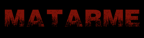
We chose to use the font above called 'scorched earth' for our title sequence as it looks creepy. We made it dark blood-red, with a black background as these are traditional colours for horror. The dark black makes the film seem mysterious and may worry the audience before the opening title sequence even starts. And the blood-red, for the obvious reason of representing the potential amount of blood shed throughout the film, and to once again, worry the audience. We decided to use capitals for our title and it seems more like it is being shouted, and overall just creates tension. As 'Matarme' means 'to kill me', we thought we should use red and black because they both relate to the word 'kill'.
(NG)
